
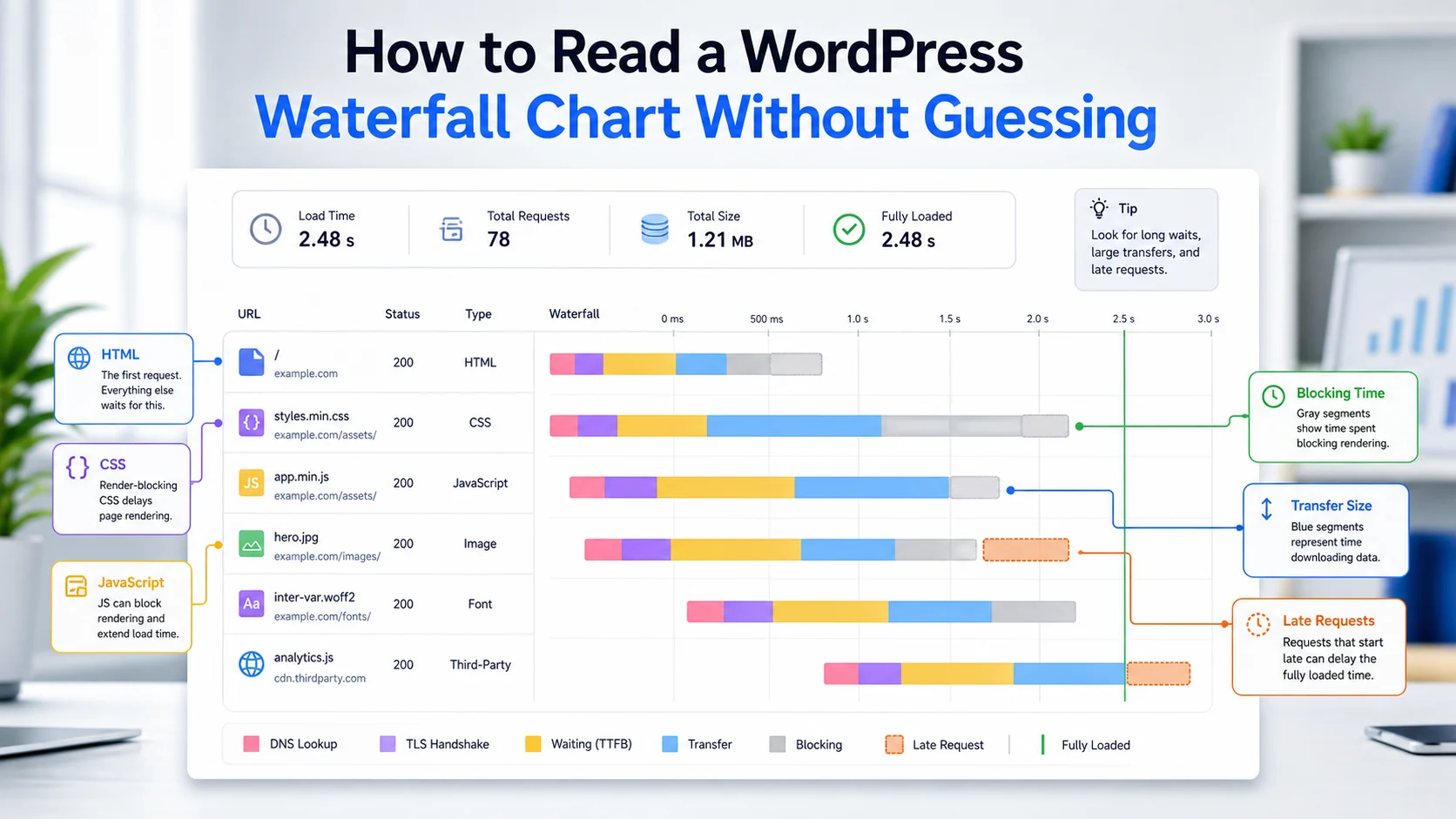
A WordPress waterfall chart is a request-by-request timeline of how your page loads. Read it top to bottom: check the first HTML request for a slow TTFB, find render-blocking CSS and JavaScript near the top, then flag heavy images and late third-party tags. The longest blocking row, not the largest file, is usually the real bottleneck.
A slow page feels mysterious when the only number you have is a score. One test says the homepage is slow, another says the product page is slower, and the team blames hosting, images, or a plugin in turn. A waterfall chart replaces opinion with evidence: an ordered view of every request the browser actually made, in the sequence it made them. This guide shows you how to read that timeline so you can name the real bottleneck instead of guessing. For the broader plan around it, pair this work with a practical WordPress performance review.
You do not need to become a network engineer. You do need to know which request starts first, which one waits too long, which one blocks rendering, and which one is not worth chasing yet. This is the diagnostic skill that turns a vague speed complaint into a short, defensible fix list.
What a Waterfall Chart Shows in WordPress
A waterfall chart in a performance tool is a horizontal timeline that reads left to right. Each row is one browser request (the HTML document, a stylesheet, a script, an image, a font, a tracking pixel). Each column adds detail such as the URL, file type, status code, size, start time, and duration. The bar on each row shows when that request started and how long each phase took, so you can see what happened early in the page load and what waited until later.
Read alongside the request list, the chart answers questions a single metric cannot. A score tells you the page is slow. The waterfall view tells you which file caused it, whether that file came from the theme, a WordPress plugin, a CDN, analytics, ads, or another outside service, and whether the delay sits before the first byte or later in delivery. Tools such as GTmetrix, WebPageTest, and Chrome DevTools all display this same shape, so the reading skill transfers across every tool you use. Each row maps to an HTTP request, so the same status codes and headers you see in the browser show up here as columns.
If your team is still choosing where to test, settle the workflow first with a repeatable website performance testing process, then treat the waterfall as the evidence layer underneath each score.
How to Read a Waterfall Chart Step by Step
Work through the chart in a fixed order. Reading it the same way every time keeps the review fast and keeps the team from arguing about the largest bar instead of the most costly one.
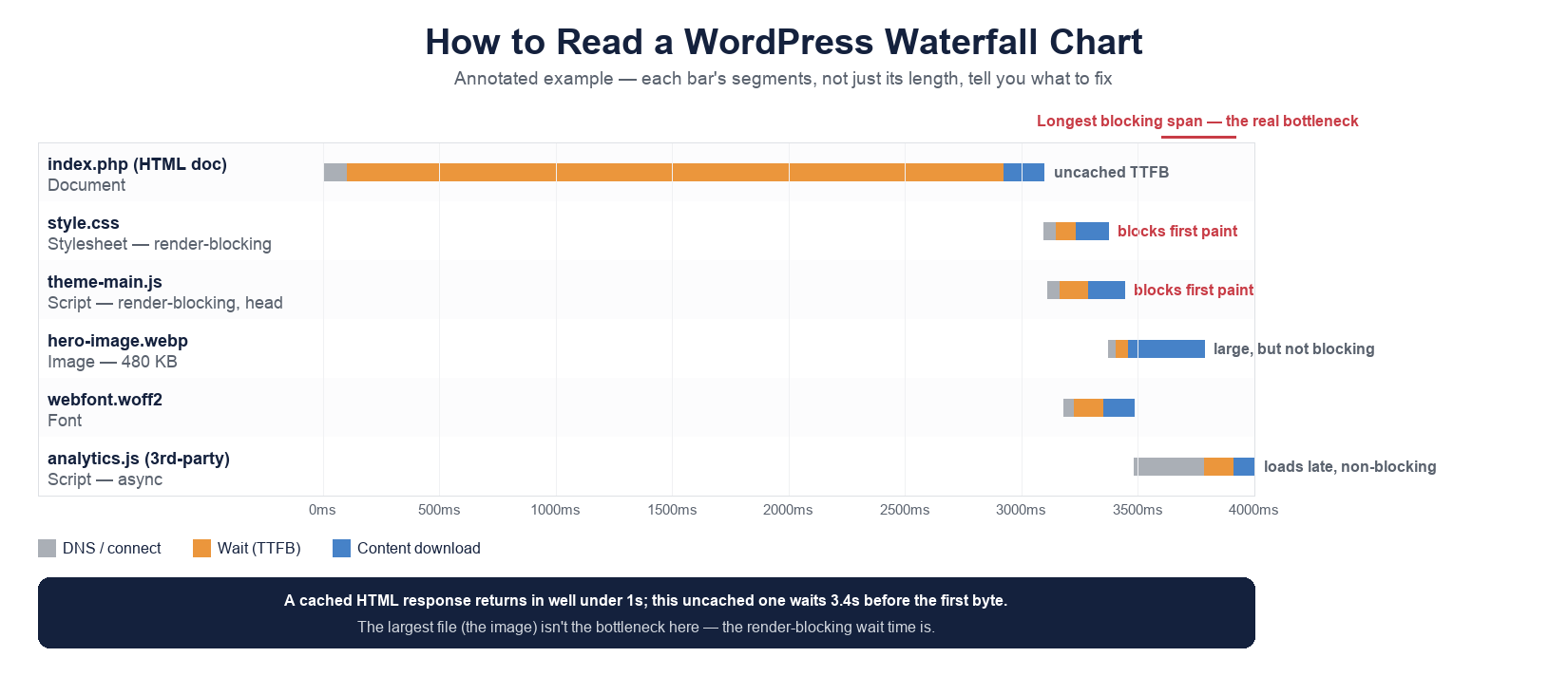
- Start with the first request. The top row is the HTML document, usually your page URL beginning with https. Look at its timing phases (DNS, connection, TLS, waiting, transfer). A long wait before the first byte is a slow TTFB, and it points at server processing, database queries, an uncached page, or a slow origin rather than at images.
- Confirm the cache layer. A stored page returns quickly because the system does not rebuild the full WordPress website for every visitor. An uncached page asks the application to assemble menus, templates, queries, and shortcodes before sending anything back. If the baseline first byte is slow, fix delivery before touching assets, and see how to reduce TTFB on WordPress.
- Find render-blocking files early. Scan the rows just under the document for CSS and JavaScript that load before the first visible screen, the same critical request path the browser must finish before it can paint. A theme stylesheet may be necessary, a marketing tag may be safe to defer. When several blocking files stack near the top, the page feels slow even when no single file is large.
- Read the timing shape. A flat early gap means the browser waited before it could continue. A tall stack of bars means many resources were requested together. A long late bar may not affect first paint but can still hurt interactivity. A color coded report makes file types easier to scan at a glance.
- Inspect one request at a time. Hover over a bar to see its phase breakdown, then click the row to open the request detail panel. Analyze the costly request, not just the longest one, and decide whether to defer, replace, reduce, or remove it.
- Judge by business impact. Start with files on the visitor first screen, the revenue path, or the lead path. A slow checkout script outranks a late decorative icon, and a delayed contact form outranks a background image below the fold.
When the chart shows early CSS or JavaScript holding up the first paint, the natural next reference is our guide to render-blocking resources, which explains how to defer or inline those assets safely.
How to Read the First Request
The first request is the baseline for everything after it. If this row is delayed, every later request starts from a weaker position, because the browser must receive enough HTML before it can discover CSS, scripts, images, fonts, and tracking files. Look closely at the phases: a long wait before the first byte is different from a large file taking time to transfer, and a redirect before the final URL is different from an origin that simply responds slowly.
This is also where stored-page behavior shows up. A cached response can return in well under a second; an uncached response on a busy origin can take 2.5s-4.0s before any markup arrives. That difference tells you whether the first delay happens before the browser can even start meaningful work, which keeps you from optimizing images when the real cost is server time.
Separate Plugin, Theme, and Hosting Delays
Many WordPress performance conversations stay vague because the team says the site is slow instead of naming the request. The chart makes the discussion specific. If a form script is late, name it. If an Elementor asset appears on a page that does not use the builder, note the row. If an optimization plugin produces a duplicate file, compare the original and generated requests before you change settings.
A single plugin can add frontend CSS, JavaScript, fonts, admin helpers, tracking beacons, or API calls. That does not automatically make it bad. The question is whether each file has a purpose on that page and whether its timing is acceptable for the job it does. WordPress plugins should be judged by evidence, not reputation: some are light, some are heavy only on specific templates, and some slow down only when combined with another script. The waterfall gives you a way to manage that review without disabling everything at once.
Use Timing Shape to Spot Patterns
The visual outline of the page often matters more than any single value. Look for the silhouette, not just the biggest file. A large hero image may be expected if it anchors the design. A small third-party script can be worse if it blocks important work. A font file might be harmless on one page yet costly on another when it creates a layout shift.
Use the chart to debug delivery order. If render-blocking assets cluster at the start, the browser pauses visible work until it receives them, so the page paints late even when total weight is modest. If late rows pile up after first paint, the cost lands on interactivity and tracking rather than on the initial view. Matching the shape to the symptom is how you turn a timeline into an insight you can act on.
Know What This Chart Is Not
The word chart causes confusion, because a performance waterfall is not the same as the business waterfall chart people build for reports. If you want to create a waterfall chart in Excel, Microsoft tools visualize a running total with floating columns, an initial value, intermediate values, and negative values along a vertical axis. In Tableau or PowerPoint you might display profit contribution with a green line, a label on each column, or a Gantt-style comparison. Some teams reach for easy charts, a customizable WordPress plugin, or a library such as the uvcharts javascript library to create waterfall charts without coding and produce diagrams for documentation.
That visualization work is easy to use, but it answers a different question. A performance waterfall view records browser requests chronologically to debug a page load; a business chart plots accounting values you paste, edit, or insert by hand. In a finance report you automate a calculation and highlight a total. In a WordPress performance report you analyze request priority, transfer cost, and the real order of delivery. Keep the two ideas separate so the action you take matches the problem in front of you.
Common Mistakes When Reading a Waterfall
The first mistake is chasing file size alone. Size matters, but timing and priority matter more: a smaller blocking script can hurt the experience more than a larger image that loads late. The second mistake is ignoring third-party requests. Analytics, chat widgets, ad tags, social embeds, and consent tools all add delay, and each one needs an owner and a periodic review even when it is commercially necessary.
The third mistake is trusting one test. Run the page more than once when a result looks unusual, and test important templates separately, because a homepage, blog post, service page, and checkout can each have a different request profile. The fourth mistake is forgetting alignment: a speed change that breaks forms, layout, navigation, or tracking is not a win. Performance work should make the page faster while preserving the reason the page exists.
What to Fix First
Once you can read the chart, the fix order almost writes itself. Start at the top of the timeline and move down, because earlier delays compound into everything that follows.
- Confirm the page is served from the intended cache layer, since a slow first byte undoes every other gain.
- Remove unused frontend assets from pages that do not need them, especially plugin CSS and scripts on templates that never use the feature.
- Defer noncritical third-party scripts so they stop blocking the first screen.
- Compress or resize the primary above-the-fold image and review font delivery.
- Audit a CDN or edge configuration if static files still transfer slowly across regions.
- Test the page again and keep the before-and-after report so you can prove the fix helped.
Change one thing at a time when you need clear attribution. If you defer scripts, compress images, switch hosting, and remove a plugin in a single pass, you may improve the page but lose the insight needed to repeat the win elsewhere. Save each report, record the test location, device, connection profile, and URLs, then compare the new chart against the baseline. For a structured version of this loop, follow a full website speed audit.
When to Ask for a Waterfall Audit
Ask for help when the same page keeps testing poorly, when a fix improves a score but hurts conversions, or when the team cannot tell whether the issue belongs to hosting, theme code, a plugin, or a third-party service. A careful audit connects timing data to business impact and produces a prioritized plan: what to change, what to leave alone, and what to test again after each adjustment. The useful outcome is not a long list of slow files, it is a short list of the requests that actually matter.
Frequently Asked Questions
What is presented in a WordPress waterfall chart?
It shows every browser request needed to build a page (the HTML document, CSS, JavaScript, images, fonts, and third-party tags) with each request timing, order, file type, size, and status code. It helps you see which resources delay the experience and why a score moved.
How does a WordPress waterfall chart work?
The tool records each request the browser makes and plots it on a timeline. The bar shows the request phases (waiting, connecting, transferring), and the vertical order shows which file the browser discovered first, so you can trace a slow page back to a specific row.
When should I use a waterfall chart?
Use it whenever a speed score is poor and you need the cause, not just the symptom. It is the right tool for diagnosing a slow first byte, render-blocking assets, heavy images, or a late third-party script, and for confirming whether a fix actually changed delivery.
Is a WordPress waterfall chart the same as a waterfall chart in Excel?
No. A performance waterfall records browser requests over time to debug page load. An Excel or Tableau waterfall plots accounting values such as a running total or profit contribution. They share a name and a stair-step look, but they answer completely different questions.
Why is my WordPress waterfall chart not showing or not loading?
Usually the test did not finish, a consent or bot block stopped the run, or the tool could not reach the URL. Re-run the test, confirm the page is public, and check that no firewall or maintenance mode is blocking the testing service before you read the result.
What is the best tool for a WordPress waterfall view?
GTmetrix and WebPageTest give clear, shareable waterfall views, and Chrome DevTools (the Network panel) is free and built in. Any of them works; pick the one your team will run consistently, since a repeated test on the same profile is more useful than a one-off score.
Can one plugin slow down only one page?
Yes. A plugin may load files only where a form, slider, builder, map, or product feature appears. That is why page-level testing matters: the homepage can be fast while a single template carries a heavy, page-specific request.
How often should teams review waterfall reports?
Review them after major theme changes, new marketing tools, plugin updates, hosting changes, and any performance complaint. For important revenue and lead pages, a recurring review beats waiting for a visible problem to surface.